Case studies for DixonBaxi
For DixonBaxi, from the studio’s designs · October to November 2026
DixonBaxi, a brand agency in London, publishes case studies of its work on its own site. I built three of those pages in Next.js and TypeScript from the studio’s designs: Royal Exchange Theatre, Inception42 and LA Rams. Each has motion driven by scroll, its own phone layout, and DatoCMS fields and GraphQL queries behind the copy.
- Royal Exchange Theatre
- Live on dixonbaxi.com: Royal Exchange Theatre (opens in a new tab)
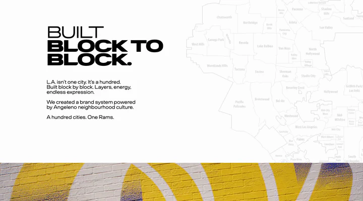
- LA Rams
- Shipped in October 2026; no longer live on dixonbaxi.com
The live pages also include the studio’s own edits since launch.
- My part
- Front end of all three pages, from the studio’s designs: layout, scroll animation, performance and the DatoCMS fields and queries.
- Design
- DixonBaxi
- Stack
- Next.js, React, TypeScript, Sass, DatoCMS
Royal Exchange Theatre
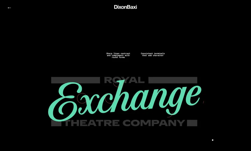
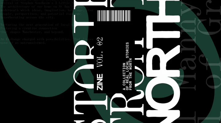
Laid out from the Figma file
Every element is placed from its Figma box as a share of its frame, with separate desktop and phone measures, so the layout holds at any width. The layout maths has unit tests.
Motion tied to scroll
Sections scrub with the page’s scroll. The logo draws its construction once it fills the screen, quotes type themselves in, and the closing poem fades in line by line. With reduced motion on, the page shows the finished layout.
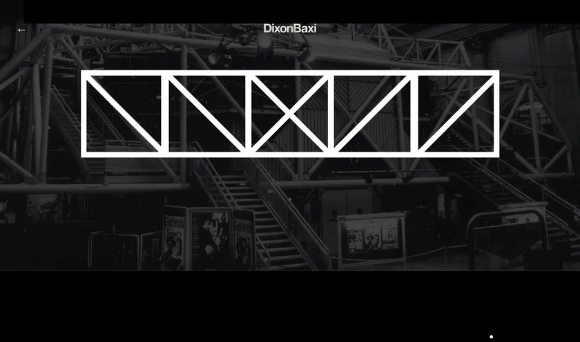
Arrows that draw and undraw
The truss arrows draw on as you scroll down and undraw as you scroll back up. They start only once their graphics are in view, so nobody arrives at a finished drawing.
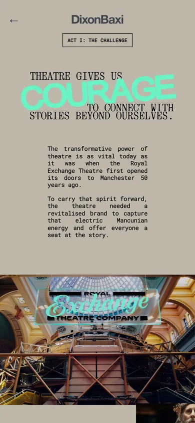
Its own phone layout
The phone layout follows the studio’s phone designs, with a 4:5 intro film made for phones. The season trailer stays locked to its screen as you scroll.
Copy that can’t break the layout
Copy and media come from DatoCMS through one GraphQL query. An empty field falls back to the shipped copy, and tests check that the fallback has a placed line for every line of the poem and a caption for every card and poster.
LA Rams
Drawings that draw in on scroll
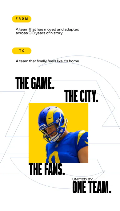
The studio’s Figma artwork comes in as SVG. Each stroke is tagged with how it arrives (traced, wiped, faded or spun in) and when, so one scroll value runs a whole drawing and CSS does the maths for each stroke.
Layers that settle into place
Layers move from an offset onto their Figma position and stay there, instead of swinging past like a parallax. Photos and films drift at their own depth. With reduced motion on, the page shows the finished layout.
Separate phone layouts
Each layered section has its own phone layout, matched to the studio’s phone designs, with its own artwork where the design called for it. Every headline, paragraph, photo and film is editable in DatoCMS.
Inception42
The product icon, built in four stages
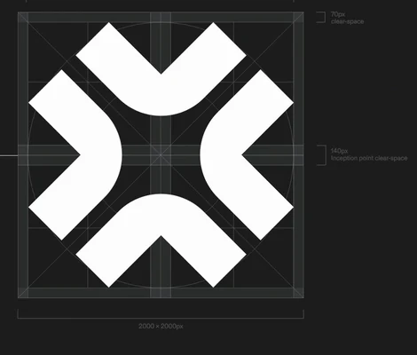
The icon is drawn on its construction grid in four scrubbed stages: grid, highlight, fill, then dimension brackets with live-text measurements. The diagrams carry descriptions for screen readers, and keyboard focus that lands off-screen scrolls the strip to it.

A horizontal strip driven by vertical scroll
The whole study, eight chapters, is one horizontal strip. It pins to the screen and slides sideways as you scroll down, then holds so the last screen’s motion finishes. Where browsers support scroll-driven animations, CSS runs every movement.
Phones: a rotate prompt and a lighter mode
An upright phone gets the studio’s rotate prompt, by design; on Android a button opens the story full screen in landscape. Held sideways, the strip scrolls in code so the browser’s bars stay hidden, and a phone that can’t keep up runs lighter.